LinkApp Landing Page: Building Pre-Launch Momentum
The Opening Challenge
We had just wrapped up the LinkApp design. The app was in development, features were finalized, and the team was heads-down building. But then came the practical question from the CEO:
"How do we get people excited about an app that doesn't exist yet?"
This wasn't just about building a landing page. This was about creating the first touchpoint of a new social experience—a digital introduction that would convert curious visitors into early adopters.
My Role
As the UX/UI Designer, I owned the entire landing page experience from concept to launch. Working under tight time constraints, I crafted a pre-launch strategy that would generate interest and build an early user base before the app release.
The Strategic Challenge
Beyond a Simple Landing Page
Landing pages often focus on features and screenshots. But our research showed that our landing page needed to:
Capture the feeling of what LinkApp would deliver—not just list features
Build trust in a market skeptical of "another social app"
Create FOMO that would drive pre-launch signups
Work flawlessly across all devices (70% of our target users were mobile-first)
The Time Constraint
I had 10 days to design and deliver. The marketing team had already scheduled the campaign launch.
Research: Leveraging What We Knew
Smart Research Reuse
Instead of starting from scratch, I leveraged the deep user insights from the main app project. But I needed to validate one critical assumption: Would our landing page approach resonate?
I conducted rapid testing with 20 target users, showing them competitor landing pages and mockups. Clear insights emerged:
💡 Key Discovery #1: "Less is More"
Users spent an average of 8 seconds on traditional landing pages before leaving. Simplicity was key to retention. Text needed to be minimal, focusing only on essential information.
🎨 Key Discovery #2: "Emotion Over Information"
Users responded more positively to colorful, playful designs that created an approachable feeling. They prioritized understanding the app's personality over detailed feature lists.
📱 Key Discovery #3: "Interaction Matters"
Static pages felt outdated. Users expected some level of interaction, even on a landing page.
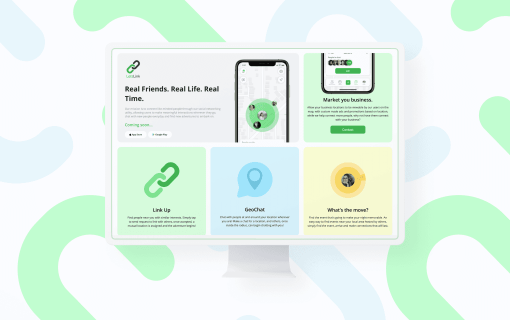
The Design Solution: Tiles That Tell a Story
The Breakthrough Concept
Instead of a traditional long-scroll landing page, I designed a tile-based narrative system. Each tile would be a micro-experience showcasing one core feature:
Why Tiles Were Effective
Scannable: Users could grasp all features in one viewport
Responsive: Natural scaling from mobile to desktop
Interactive: Each tile responded to hover/tap
Memorable: The playful design was easy to recall
The Three-Act Structure
I designed each feature tile as a mini-story:

Act 1: LinkUp (Green tile)
Title: "Link Up"
Animation: Pulsing chain link
Act 2: GeoChat (Blue tile)
Title: "GeoChat"
Animation: location pin is pulsating inside the chat bubble
Act 3: What's the Move? (Yellow tile)
Title:"What's the Move?"
Animation: Radar-like animation around avatar
Bringing the Design to Life

The Animation Strategy
Based on user feedback about wanting interaction, I implemented a thoughtful animation sequence:
Sequential Reveal: Tiles animate in order, creating a narrative flow
Micro-interactions: Hover states that reward exploration
Performance-First: Optimized animations that work on any device
Mobile-First, But Desktop-Delightful
The tile system was elegant in its simplicity:
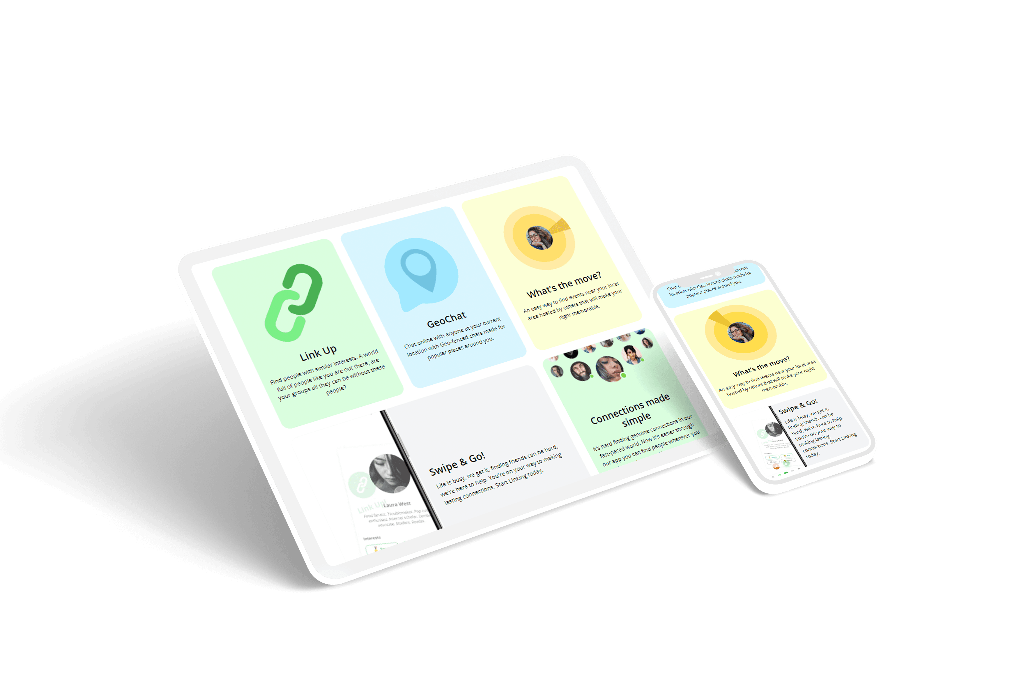
Mobile: Single column, thumb-friendly tap targets
Tablet: 2-column grid maximizing screen real estate
Desktop: 3-column layout with enhanced hover states
The Launch Sprint
Rapid Testing, Real Results
With only days before launch, I conducted usability tests with 20 users. Key improvements emerged:
Before: Animations played simultaneously (chaos)
After: Animations were made smoother and now motion starts in order, allowing user to get a glance of all the features, catching user's attention one at a time.
Before: Complex 5-field signup form
After: Subscription form was simplified to allow better user conversion with less sections.
Before: No social proof
After: Links to social networks were added, to help users get news about LinkApp on platform of their choice: Tiktok, Facebook, Instagram, Snapchat.
The Impact:
Launch Results
Landing page allowed LetsLink LLC team to showcase app features and get prospective users sign up for updates, securing initial userbase right at the time of release, creating strong momentum for the app launch.
The results validated our approach:
🚀 Pre-Launch Performance
1,200+ email signups in first two weeks
8% email signup rate (industry average: 2-3%)
Average time on page: 0:48 (competitor average: 0:32)
Mobile signup rate: 76% (validating our mobile-first approach)
📱 App Launch Impact
Day 1: Strong initial downloads from email list
Week 1: Smooth launch with engaged early users
Month 1: Established active user base
The Organic Growth
The design resonated with our target audience:
Positive user feedback about the playful, approachable design
Social media engagement increased compared to previous campaigns
Word-of-mouth referrals became a notable growth driver
Lessons That Influenced My Design Approach
1. Constraints Breed Creativity
The 10-day deadline forced radical simplification. The result? A cleaner, more impactful design than any long timeline could have produced.
2. Motion Is Emotion
Those simple animations did more to convey the app's personality than any copy could. Movement creates meaning.
3. Validate, Don't Assume
Even with existing research from the app project, I still conducted targeted testing specific to the landing page context. Different touchpoints need different validation—what works in an app doesn't automatically work for a landing page.
The Bigger Picture
The LinkApp landing page proved that with the right approach, you don't need months or massive budgets to create something effective. You need clarity, creativity, and the courage to try something different.