Helping Shoppers Stop Overpaying and Start Saving
We’ve all been there: you buy a new gadget, only to see it advertised for less somewhere else the very next day. This frustrating experience is all too common. In today's market, prices are constantly changing, and the process of finding the best deal is often time-consuming and confusing. Price Detective was born from a simple idea: what if we could empower shoppers to effortlessly find the best price for any item, every single time?
The Challenge
While most large retailers offer price matching, it is on the consumer to do the research, find the lower price, and prove its validity at the checkout counter. This process is cumbersome and often abandoned, leaving significant savings on the table. Our challenge was to design a mobile application that would automate this process, making it simple, fast, and even enjoyable for users to claim the savings they deserve.
My Role & Responsibilities
As the Product Designer on this project from October to December 2022, I was responsible for the end-to-end design process. This included:
UX Research: Conducting user interviews, surveys, and competitive analysis to understand the problem space.
Ideation & Strategy: Brainstorming solutions and defining the core features of the app.
UX/UI Design: Creating user flows, wireframes, high-fidelity mockups, and interactive prototypes.
Usability Testing: Gathering user feedback to iterate on and refine the design.
The Design Process
1. Understanding the User: Empathy & Research
To kick things off, I conducted interviews with a diverse group of shoppers and deployed a survey to gather quantitative data on their habits, frustrations, and motivations.
Key Quantitative Insights:
82% of surveyed shoppers felt they had overpaid for an item in the past month.
65% knew about price matching policies but had never used them.
When asked why, 70% cited the "time and hassle" of finding proof as the primary reason.
Key Qualitative Insights:
Lack of Awareness: "I just assume the price is the price. I don't have time to check every store."
Time is Money: "It's not worth my time to save a few dollars, even if it adds up."
Proof is a Pain: "I feel awkward holding up the line to show a cashier my phone."
2. Defining the Problem: How Might We...
With a clear understanding of the user's pain points, I framed the problem using the "How Might We" method:
How might we make discovering price differences effortless?
How might we streamline the process of claiming a price match?
How might we make saving money feel rewarding and engaging?
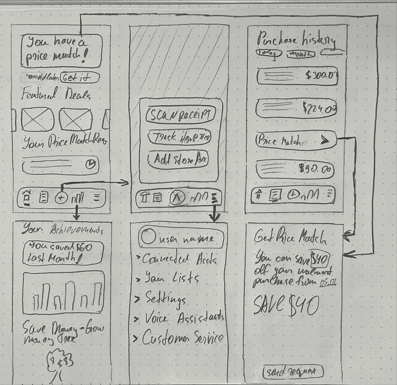
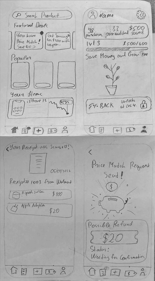
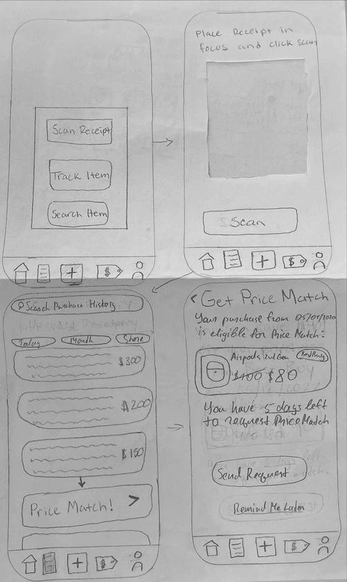
3. Ideation: Sketching a Solution
I began sketching out ideas, exploring different ways a user could interact with the app. This low-fidelity approach allowed me to quickly iterate on concepts without getting bogged down in the details. The core idea that emerged was a simple, three-step process: Scan, Compare, Save.
4. Design & Prototype: Bringing the Vision to Life
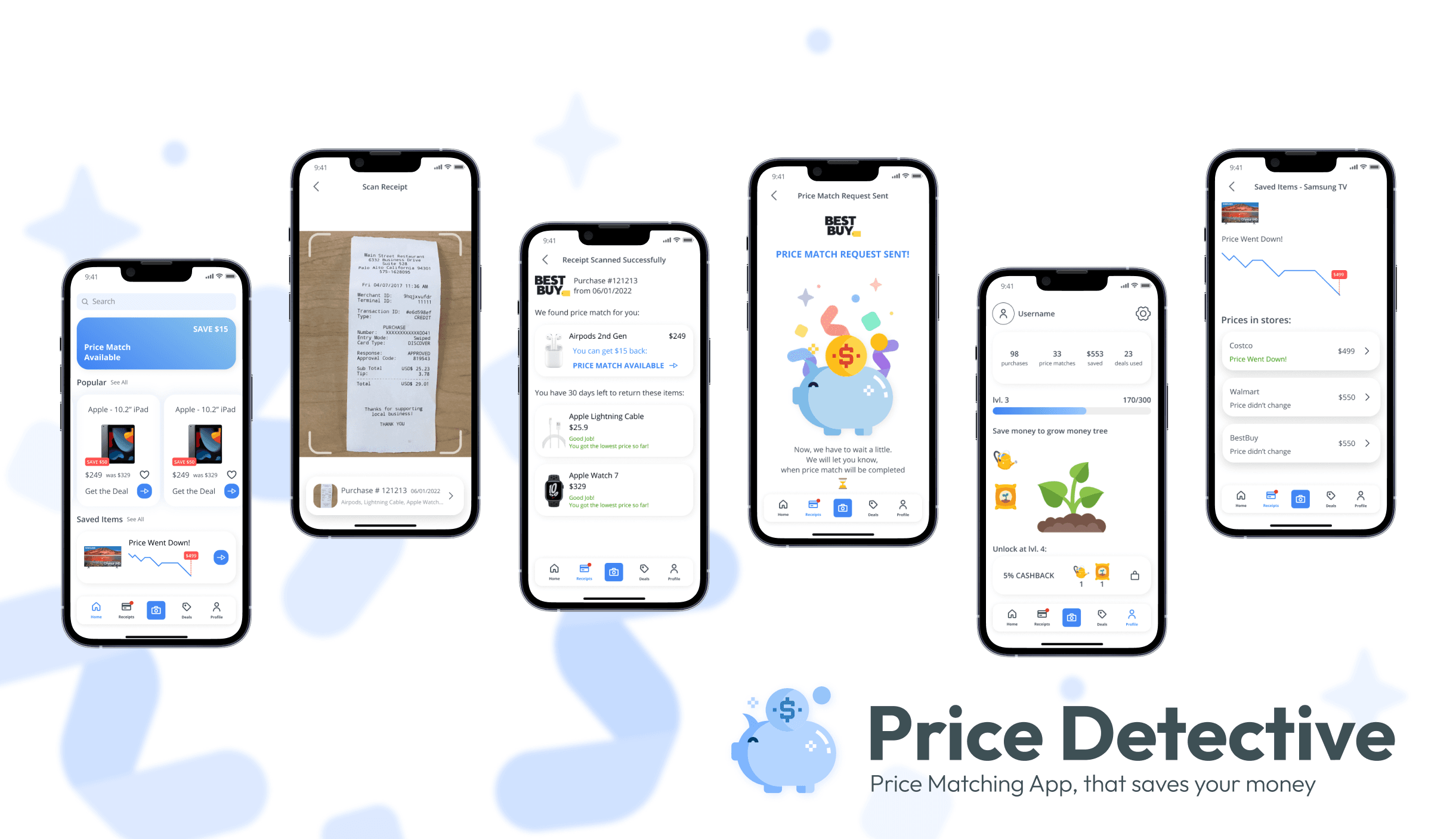
I then moved into creating high-fidelity wireframes and an interactive prototype. The design was guided by the principles of simplicity and clarity. Key features included:
Feature 1: The Receipt Scanner To tackle the issue of manual data entry, I designed an OCR-powered receipt scanner. Users can simply snap a photo of their receipt, and the app automatically digitizes the items and prices, saving valuable time and effort.
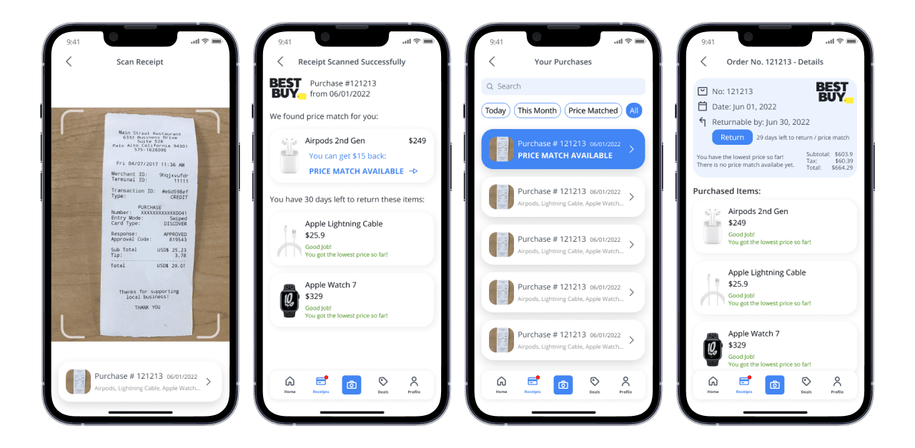
Feature 2: Real-Time Price Comparison Once items are scanned, the app's core engine gets to work. It scours the web and local retailer databases in real-time to find lower prices, instantly showing users how much they can save on each item. This provides immediate, actionable feedback, along with an option to request a price match automatically.

Feature 3: The Digital "Deal" Card To solve the "awkward at checkout" problem, I designed a simple, non-confrontational "Deal Card." This single screen cleanly presents the competitor's lower price, the product details, and a link to the offer, giving the cashier everything they need to approve the price match quickly.
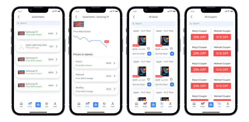
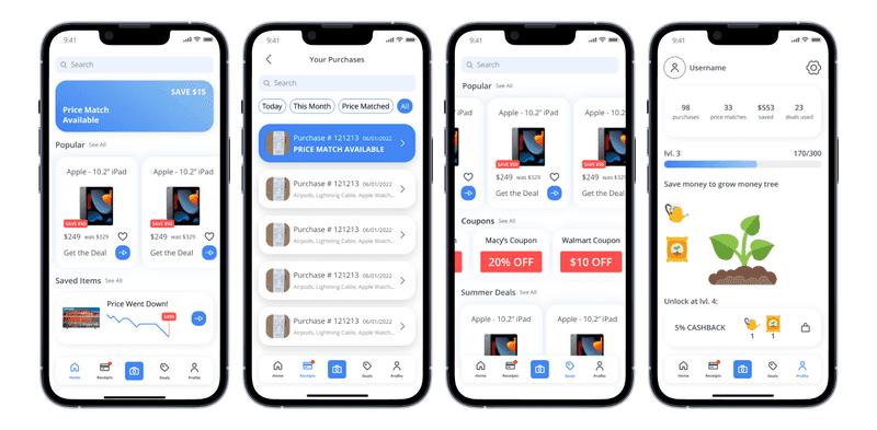
Feature 4: The Savings Tracker To make saving money feel rewarding, I designed a gamified dashboard. It visually tracks total savings over time with engaging charts and milestones, turning the chore of saving money into a motivating and enjoyable experience
Outcomes & Lessons Learned
While this was a conceptual project, the process of designing Price Detective reinforced several key lessons:
The Power of Simplicity: The best solution is often the one that removes the most friction. By focusing on a simple, core user journey, we can create products that are both powerful and easy to use.
Design for Emotion: Saving money is not just a rational act; it's an emotional one. By incorporating elements of gamification and positive reinforcement, we can create a more engaging and habit-forming product.
Iterate, Iterate, Iterate: The initial sketches were a world away from the final prototype. The process of gathering feedback and iterating on the design was crucial to arriving at a solution that truly met the user's needs.
This project was a valuable opportunity to hone my skills in user research, interaction design, and visual design. I'm proud of the final result and excited to apply these learnings to future challenges.